So for starters I can see my main benefit from this will be just taking the time to think about what colours I want to use in my film. But also what struck right away was the fact that I will most likely be learning lots more new terminology that will actually become very useful. It is an area I feel familiar with when it comes to what a colour conveys to the audience but i feel a little more lost when it comes to terminology then i often see being thrown around like "Hue".
My main explanation for this would be that Hue is terminology for one of the many aspects used to describe the colours we see. Almost like the base colour, you then have saturation, tone (brightness and darkness) that also control how we perceive the original hue.
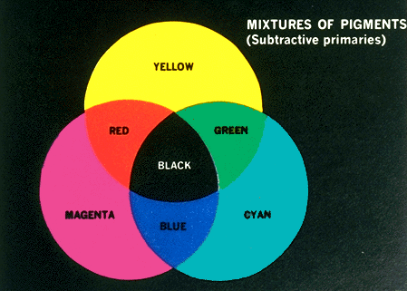
From what i gathered in lecture Hue is basically what most of us will quickly refer to as "colour" the spectrum of light that is visible to our eyes and the value appears differently according to the frequency of the waves. Even more technically explained was this description I found "the degree to which a stimulus can be described as similar to or different from stimuli that are described as red, green, blue, and yellow,"
My main explanation for this would be that Hue is terminology for one of the many aspects used to describe the colours we see. Almost like the base colour, you then have saturation, tone (brightness and darkness) that also control how we perceive the original hue.